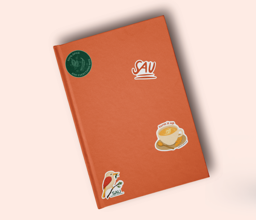
About the Brand
SAU is a UK-based brand offering 100% pure Indian spices with no additives. Named after the Hindi word सौ (Sau), meaning "100%," the brand embodies a commitment to quality and authenticity. SAU ethically sources its spices, supporting sustainable farming practices while delivering genuine Indian flavors to consumers who prioritize clean, natural ingredients.
For the logo, we opted for a typographic wordmark rather than a symbol. A wordmark can be just as memorable but avoids clashing with any illustrations or symbols on the product packaging. Since the logo’s application is limited to packaging and a web page, we concluded that this approach would be both effective and versatile. We selected a simple sans serif typeface to create a modern look that complements the brand’s contemporary values while sparking curiosity about SAU, encouraging people to explore and learn more about the brand.
The brand’s earthy color palette - featuring green, warm orange-brown, and golden yellow - symbolizes purity, tradition, and vibrancy. Green represents nature and ethical sourcing; orange-brown conveys warmth and heritage; and golden yellow highlights the freshness of the spices.
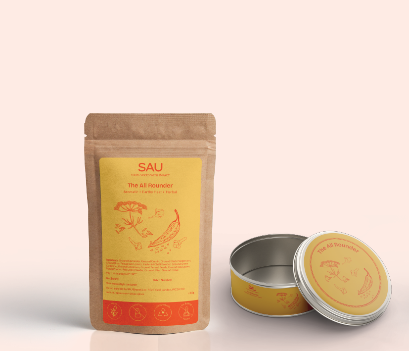
Blend 1 - The All Rounder
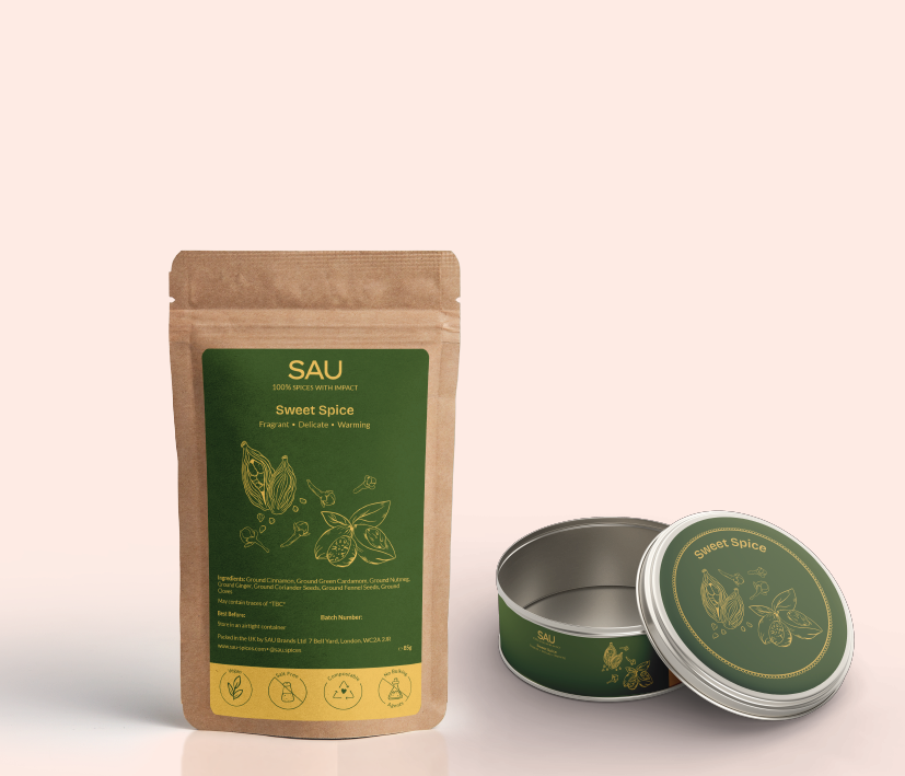
Blend 2 - Sweet Spice
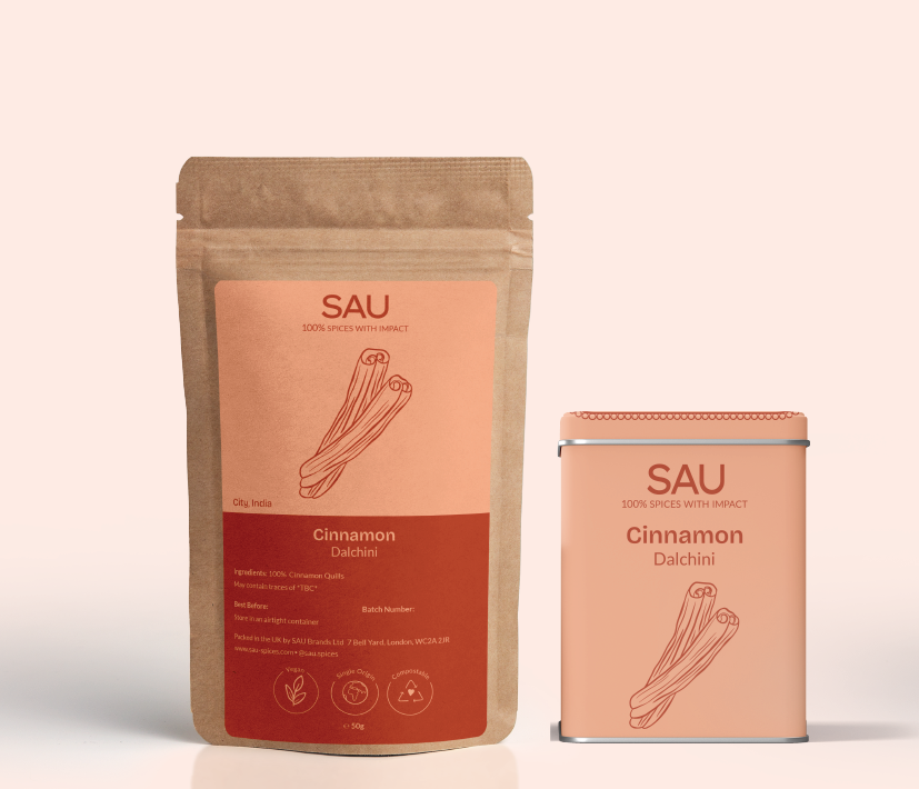
100% Cinnamon
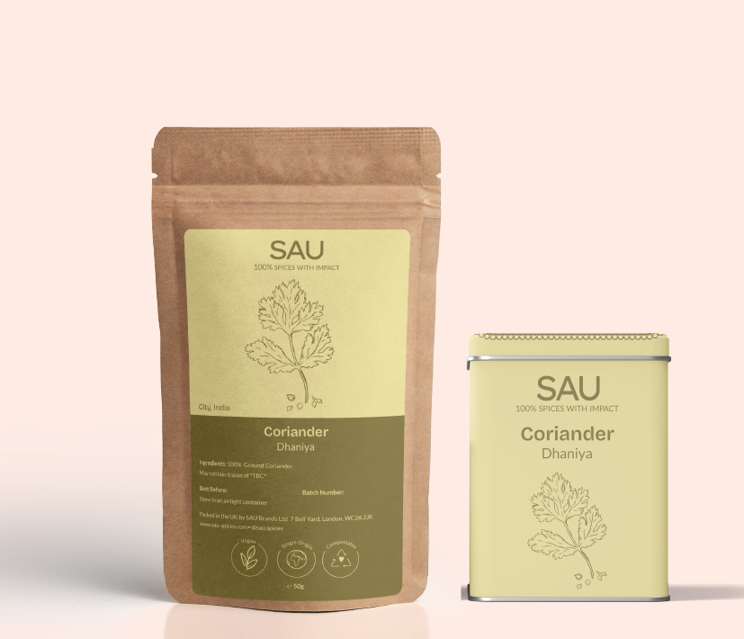
100% Coriander
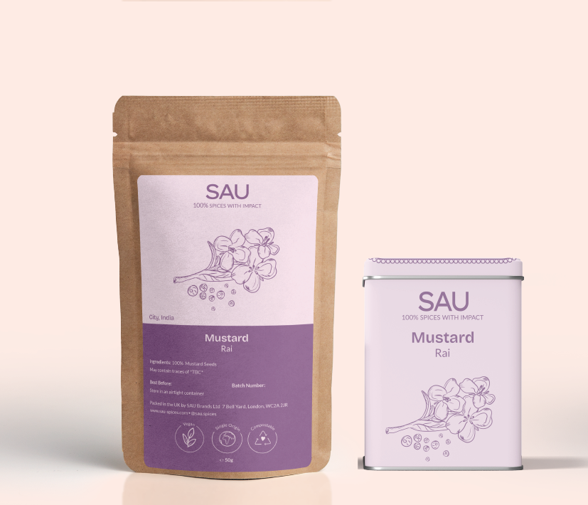
100% Mustard
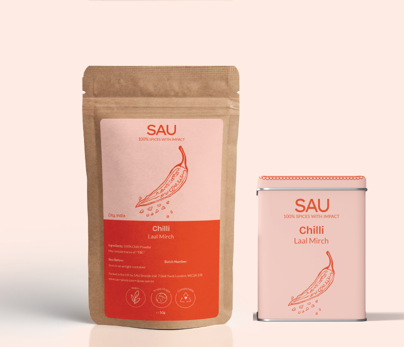
100% Chilli
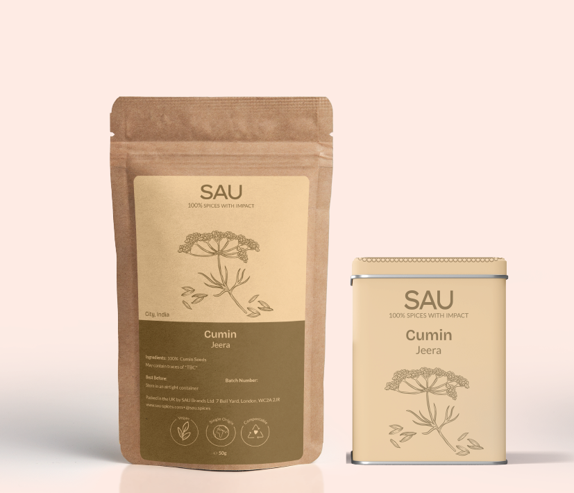
100% Cumin
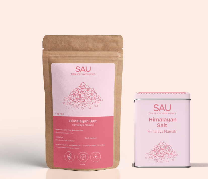
100% Himalayan Salt
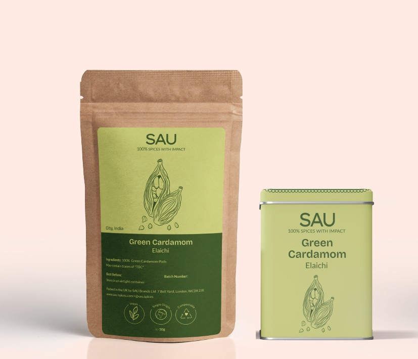
100% Green Cardamom
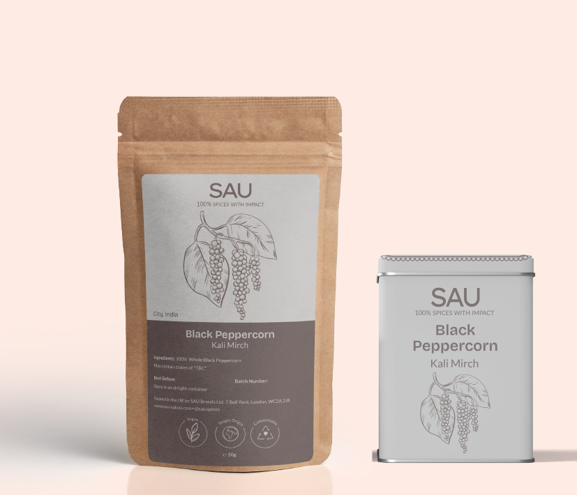
100% Black Peppercorn
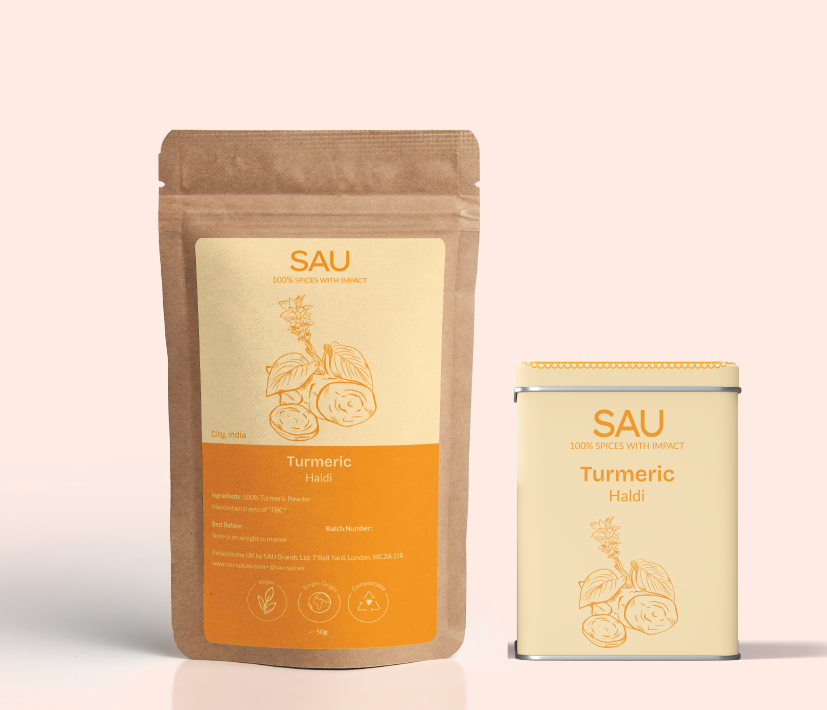
100% Turmeric
