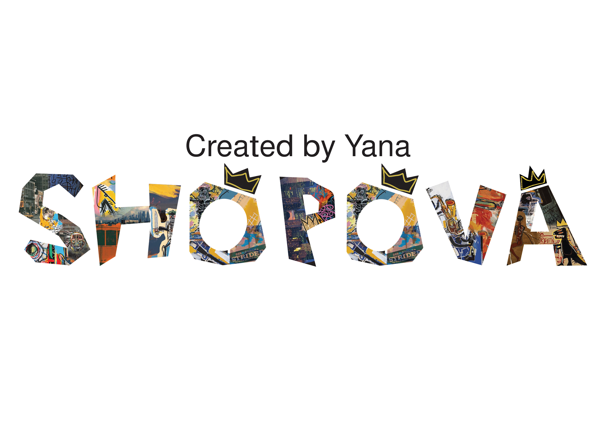
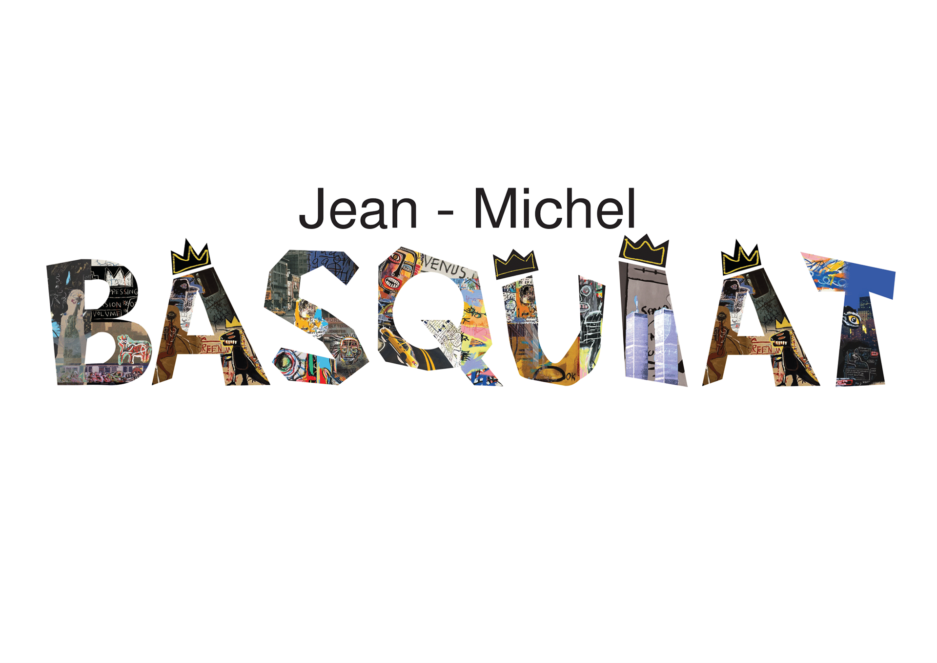
My alphabet project draws inspiration from the life and work of Jean-Michel Basquiat, particularly his art and his experience living in 1980s New York. What captivates me about his work is its raw, childlike quality and unfiltered expression. The vibrant colors and dynamic textures that bring his pieces to life were elements I wanted to incorporate into my alphabet design.
I began by creating custom letter shapes in Adobe Illustrator, giving them the appearance of being roughly cut out with scissors, as one might do in a collage. My goal was to maintain a playful, childlike aesthetic throughout the alphabet. Once the letters were ready, I moved them into Adobe Photoshop, where I selected paintings by Basquiat that resonated with the aesthetic I was aiming for. Additionally, I included images of 1980s New York - its towering buildings, bustling streets, graffiti, and public transportation - to capture not only Basquiat’s art but also the urban environment that shaped his creative vision.
I combined these images by cutting out sections and arranging them within the letterforms, mimicking the effect of a collage. The slightly scrappy, imprecise look I aimed for is something I personally associate with Basquiat’s style. For most of the letters, I kept the color scheme vibrant, ensuring the palette still echoed Basquiat’s distinctive energy.
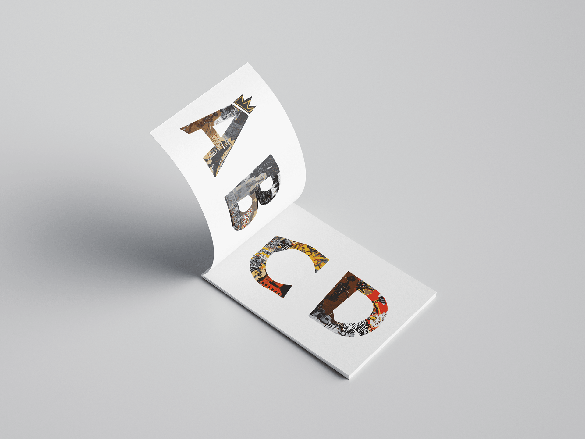
Mockup 1
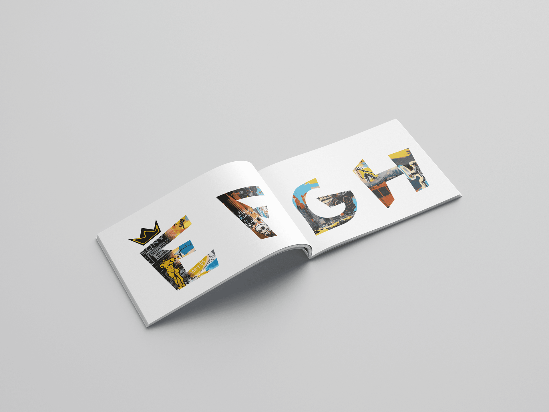
Mockup 2
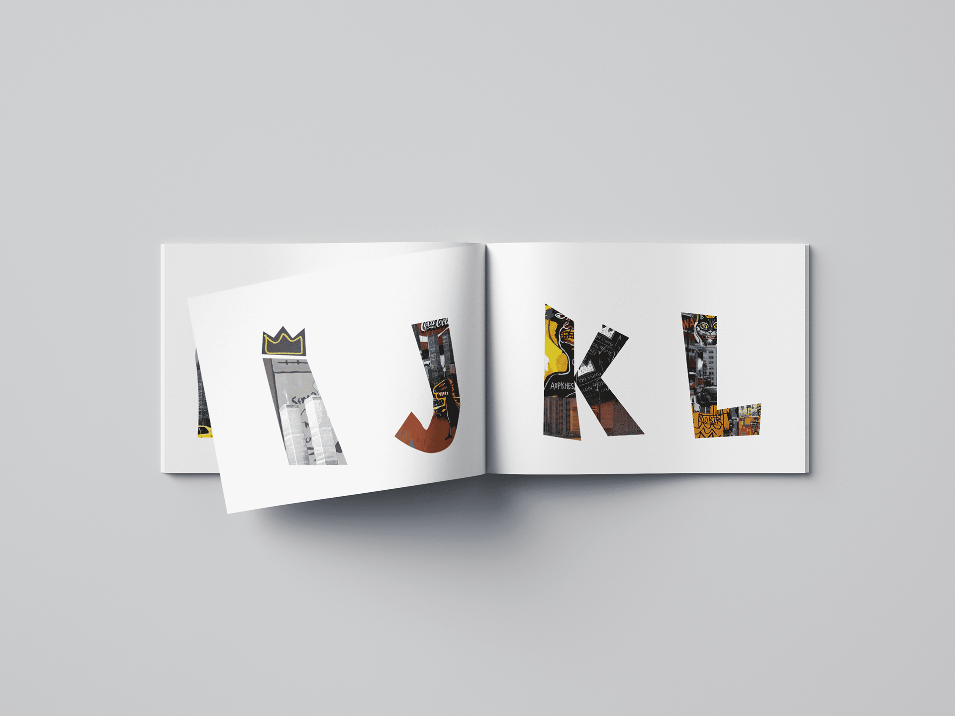
Mockup 3
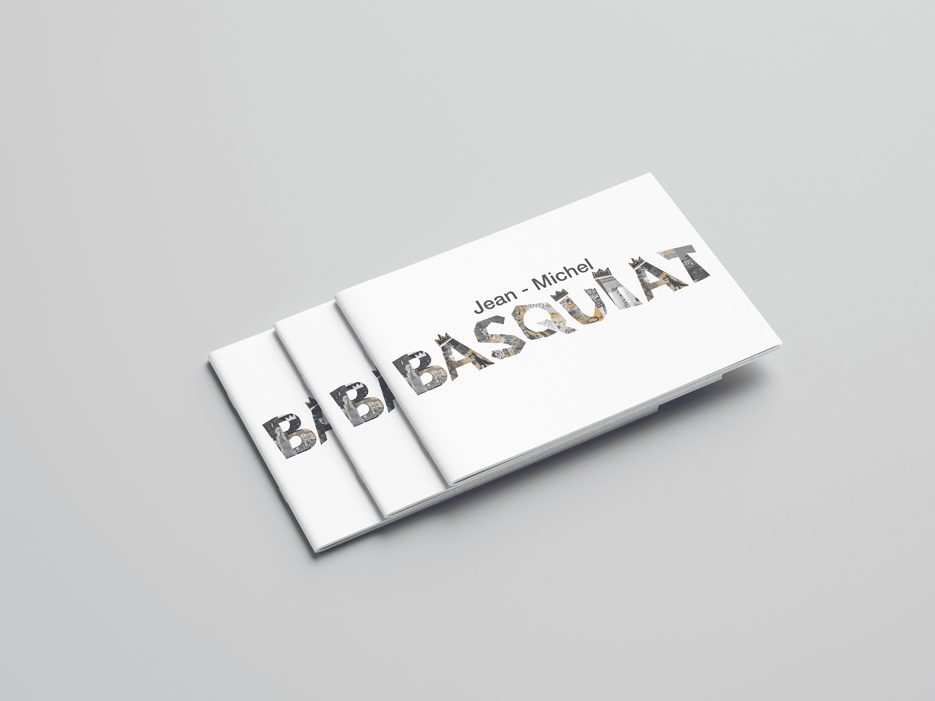
Mockup 4
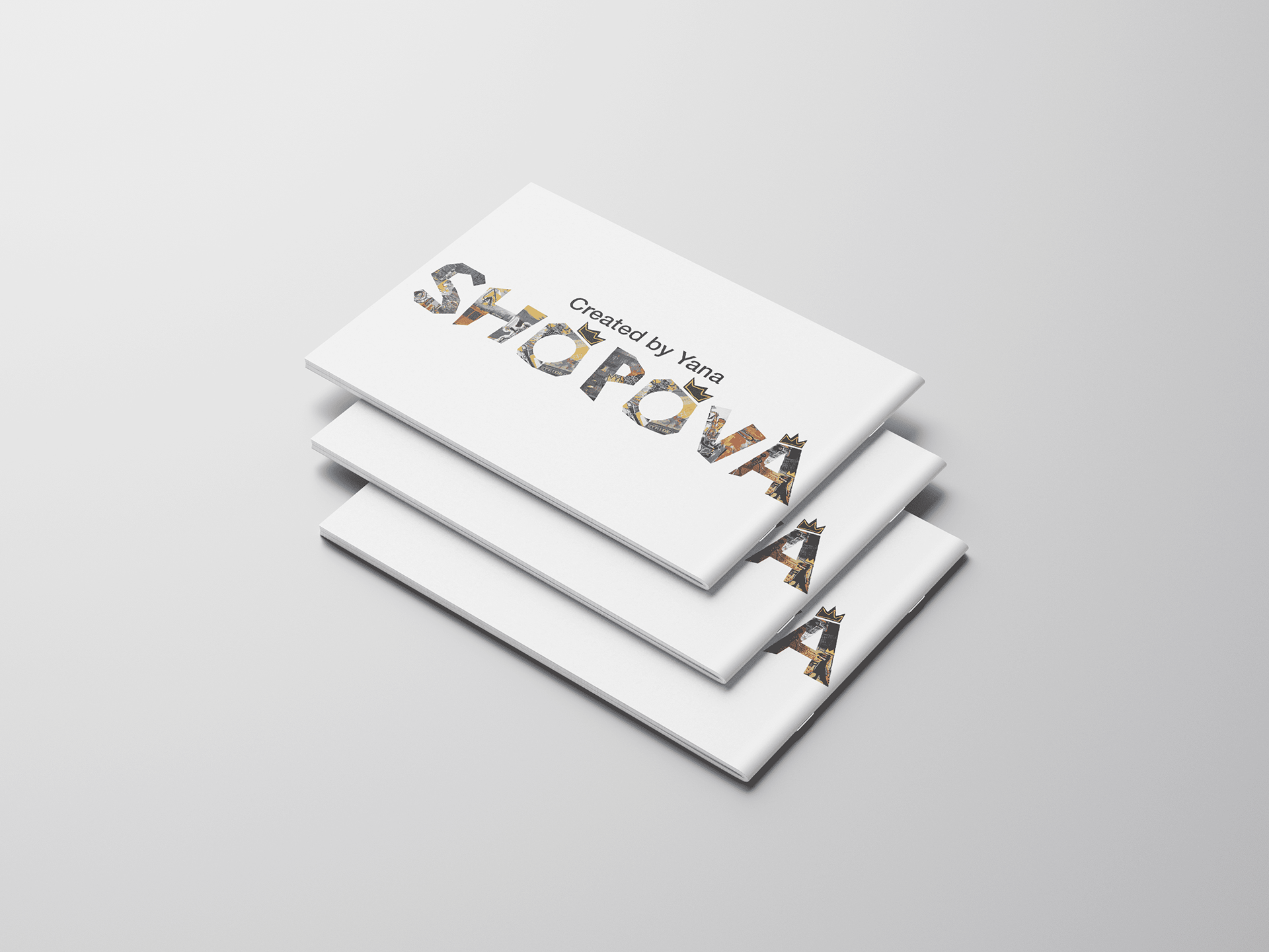
Mockup 5
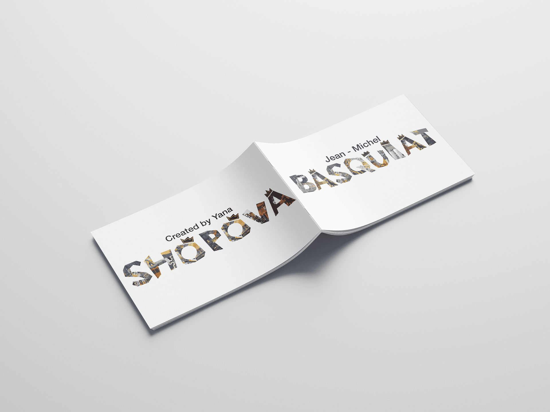
Mockup 6
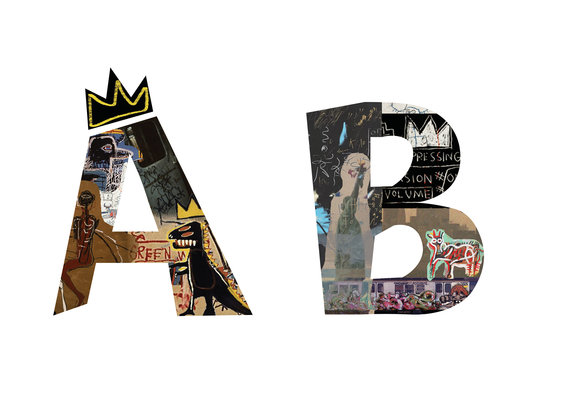
A-B
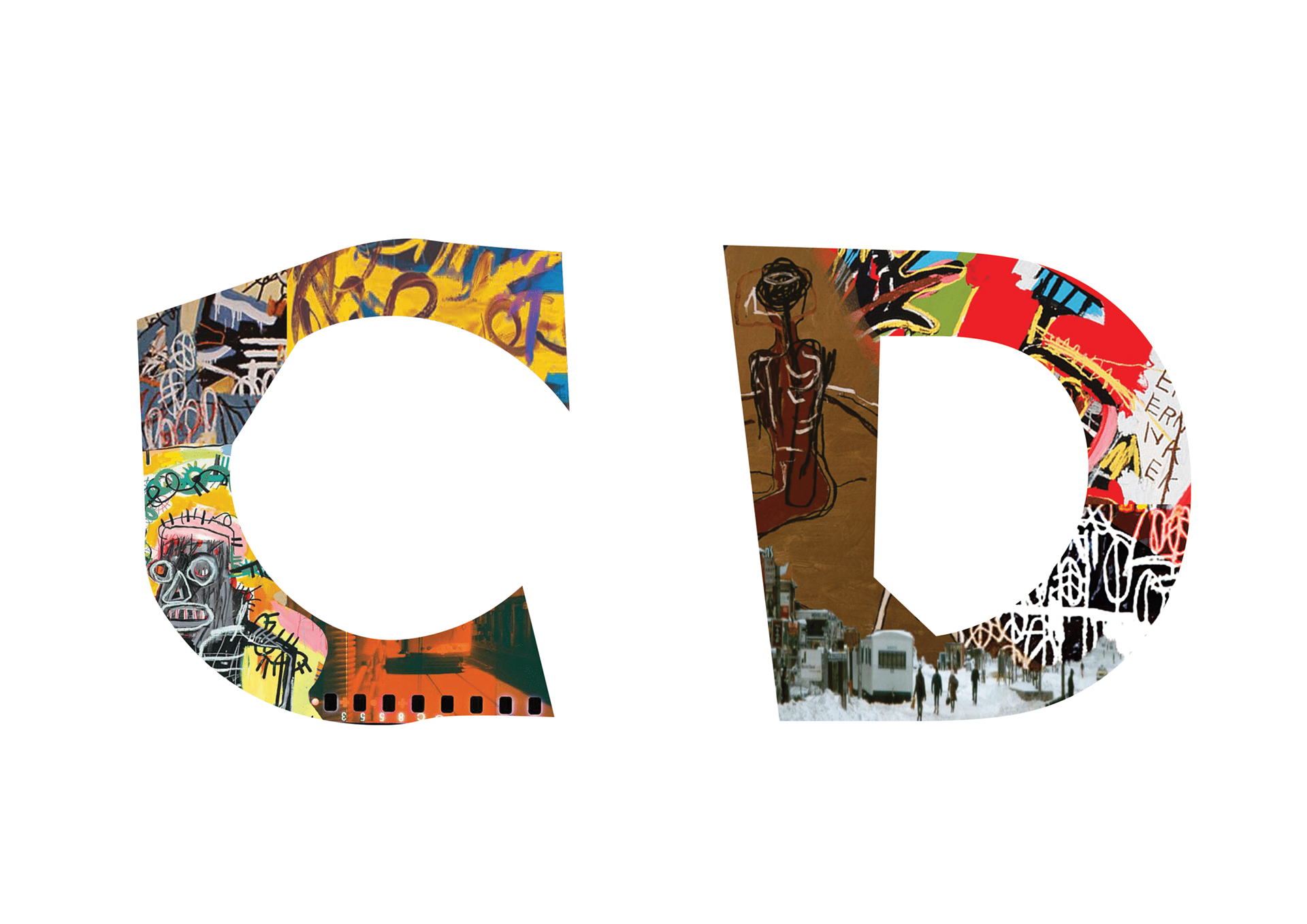
C-D
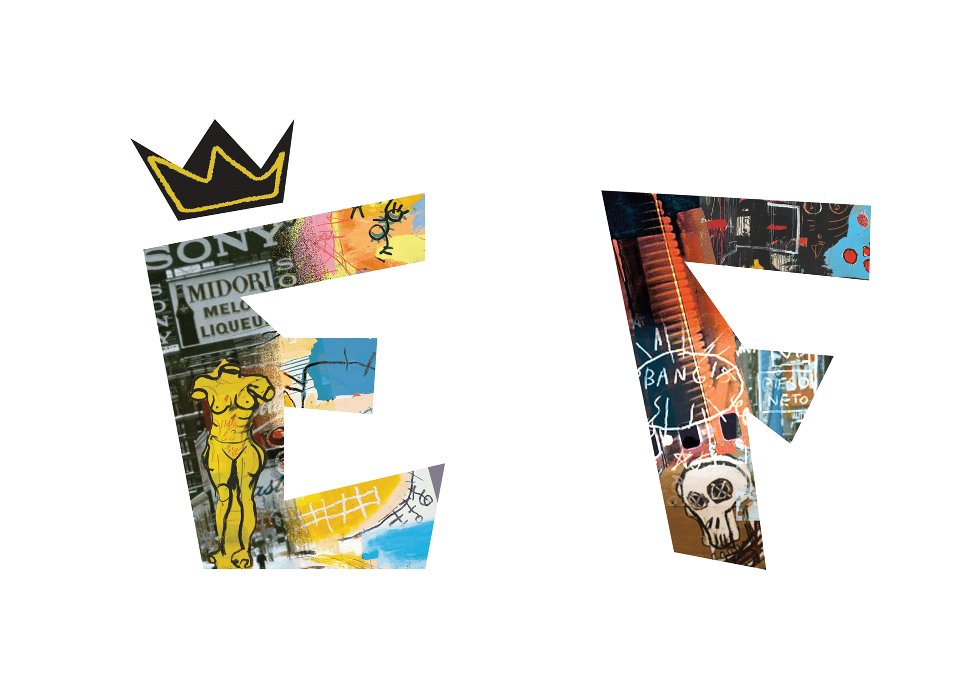
E-F
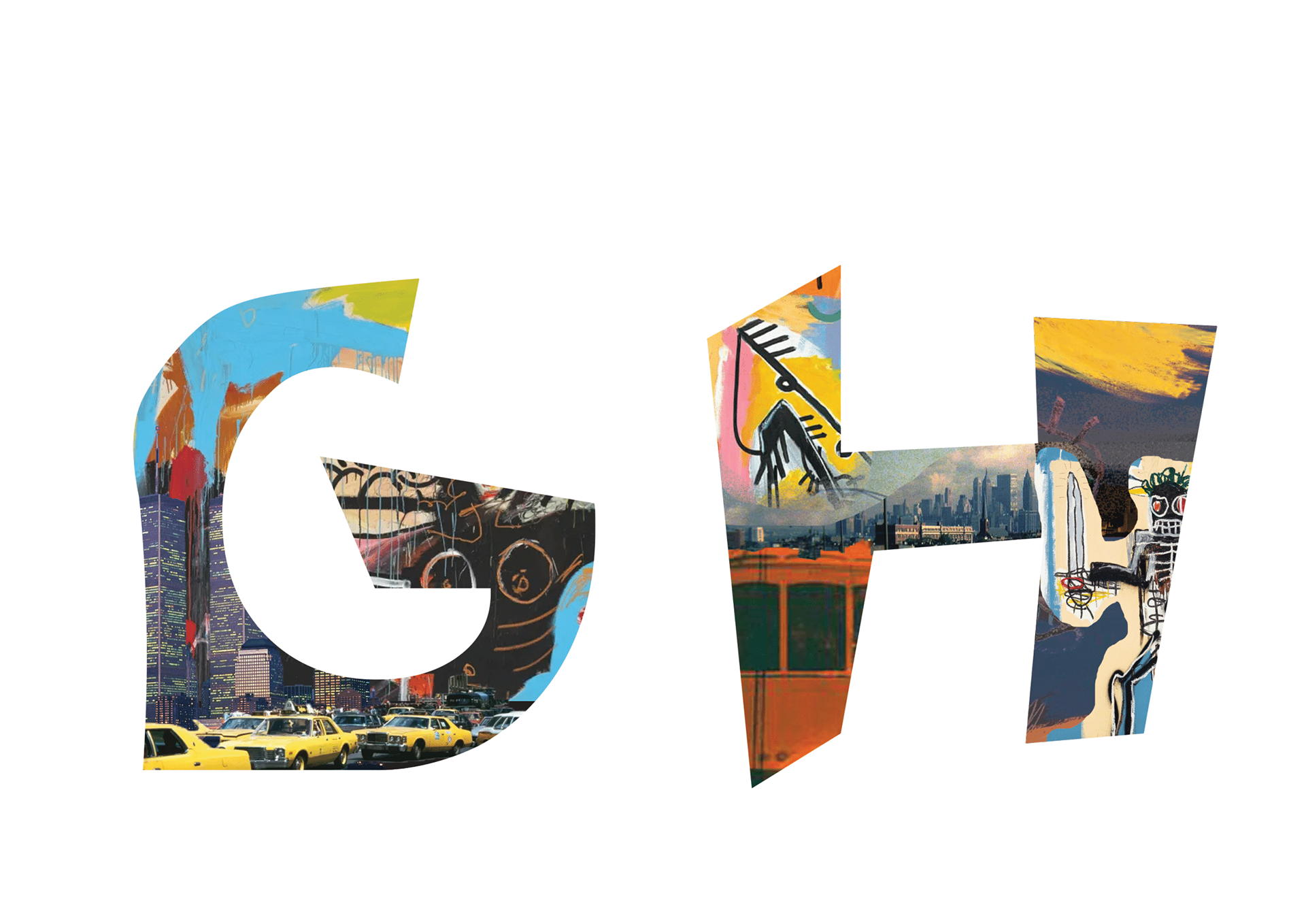
G-H
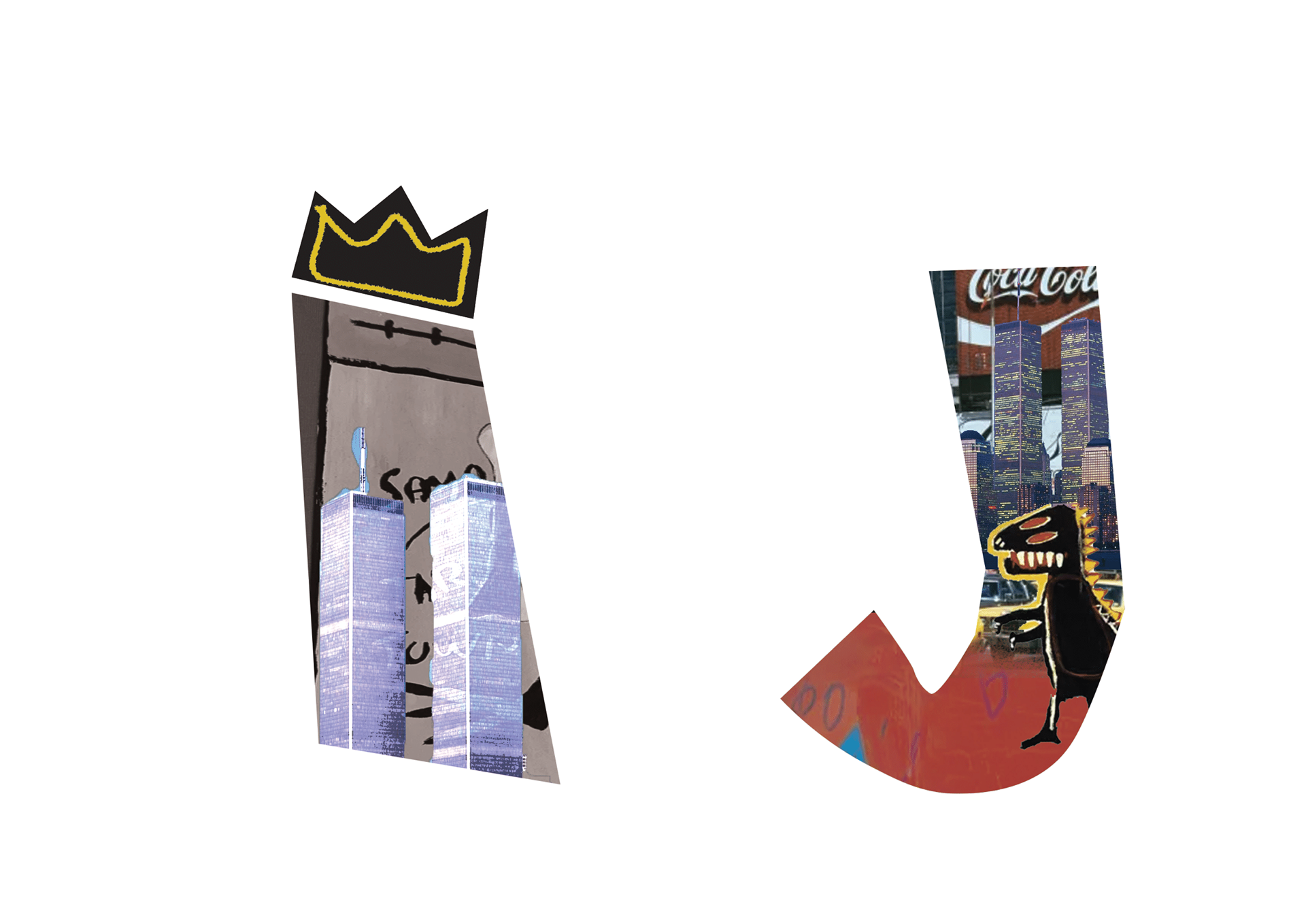
I-J
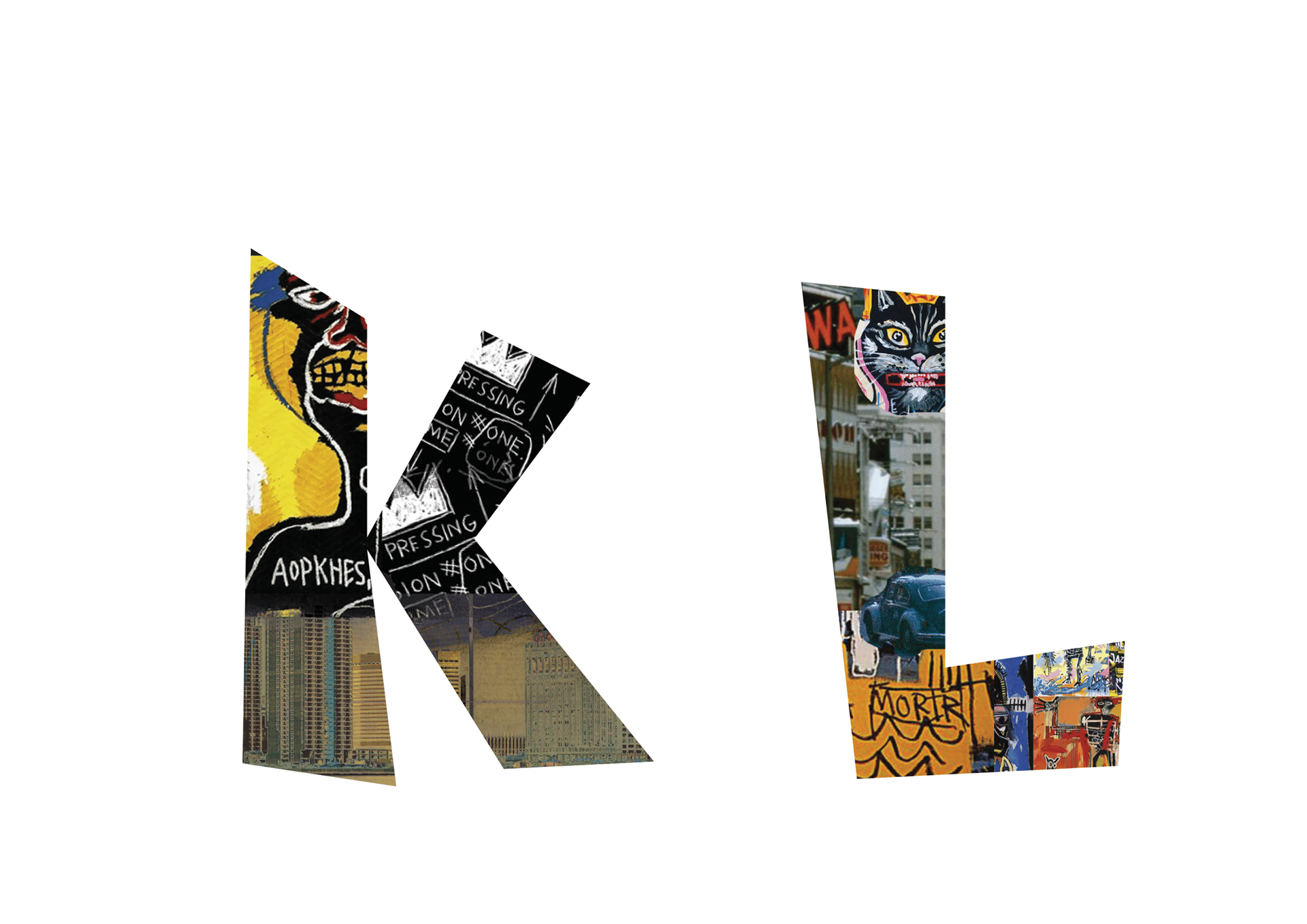
K-L
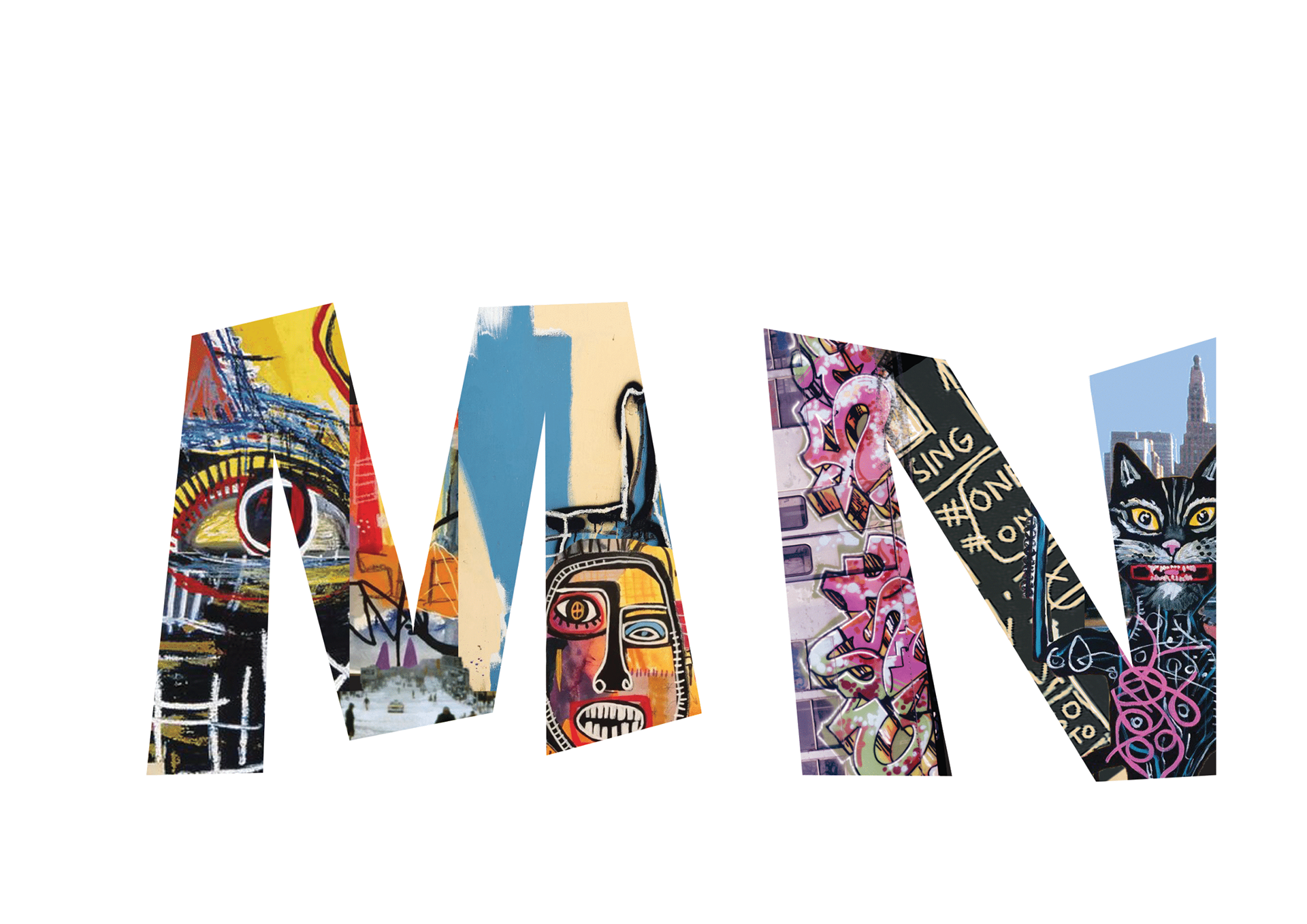
M-N
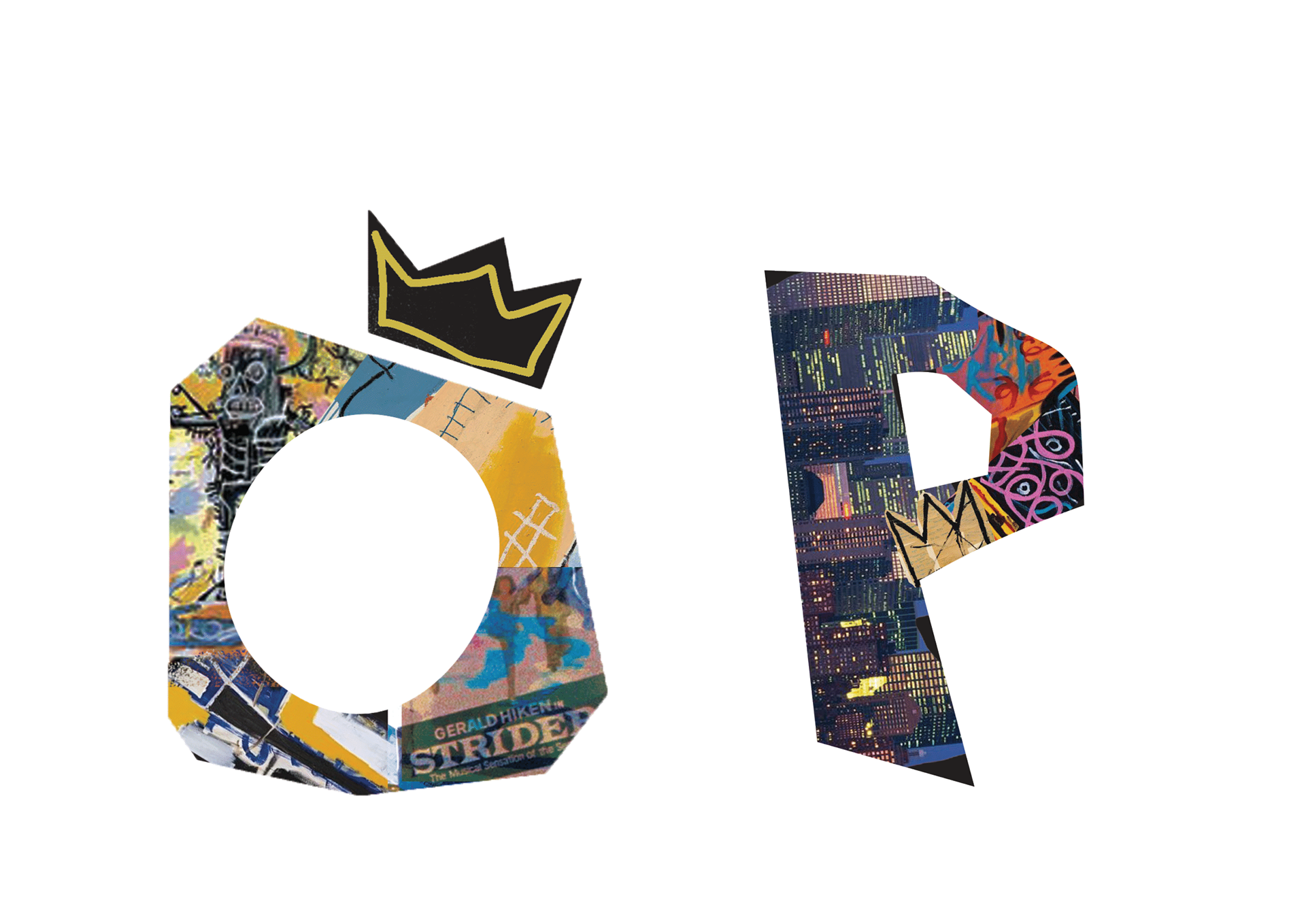
O-P
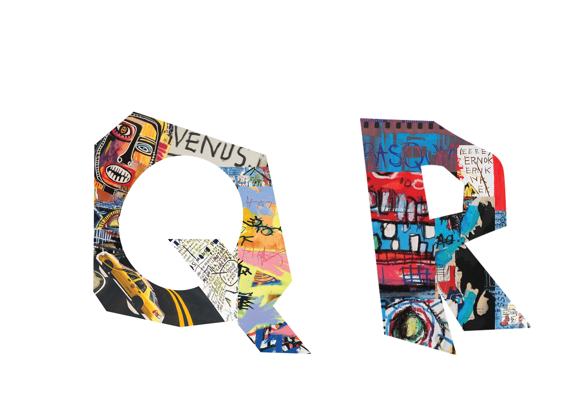
Q-R
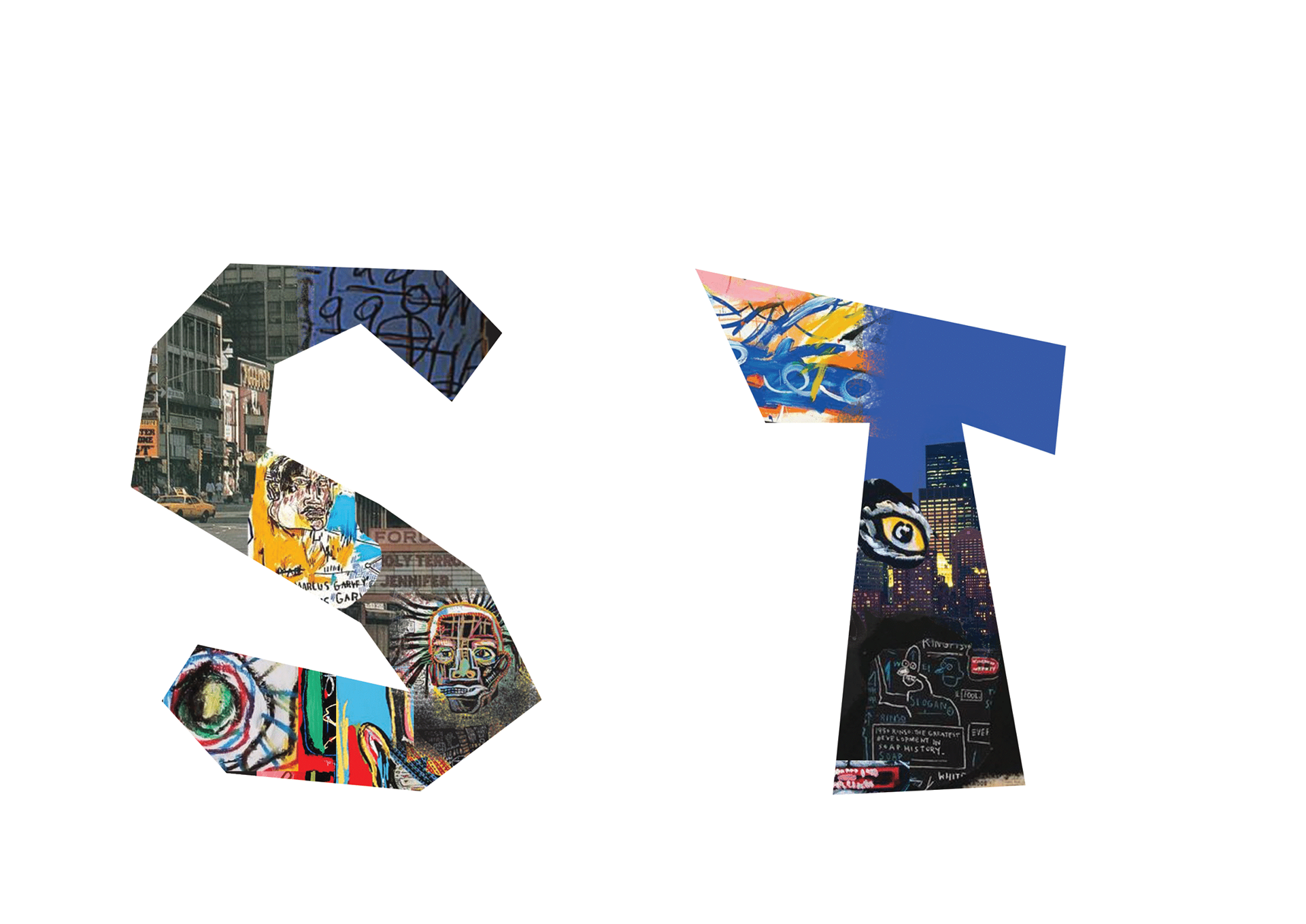
S-T
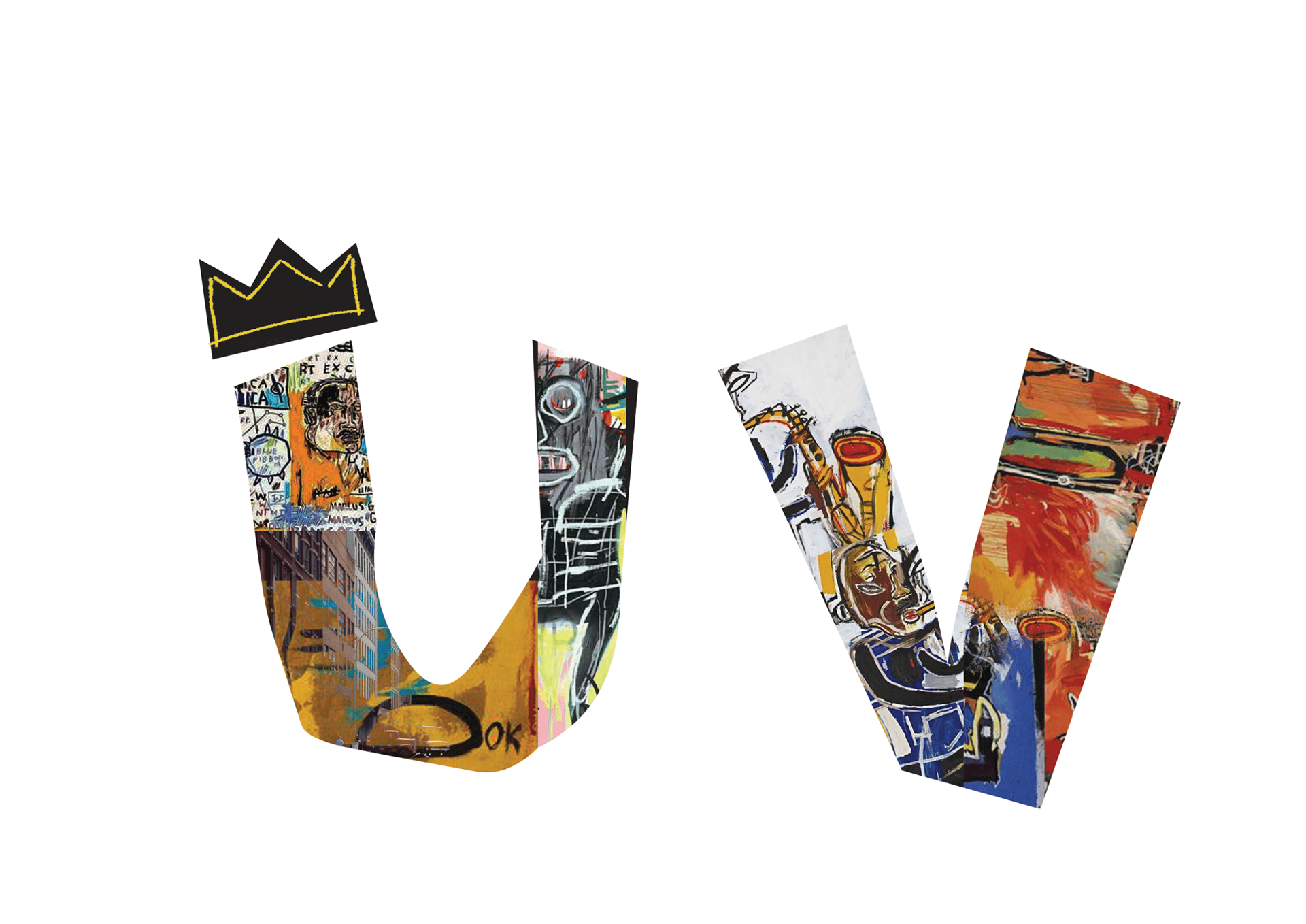
U-V
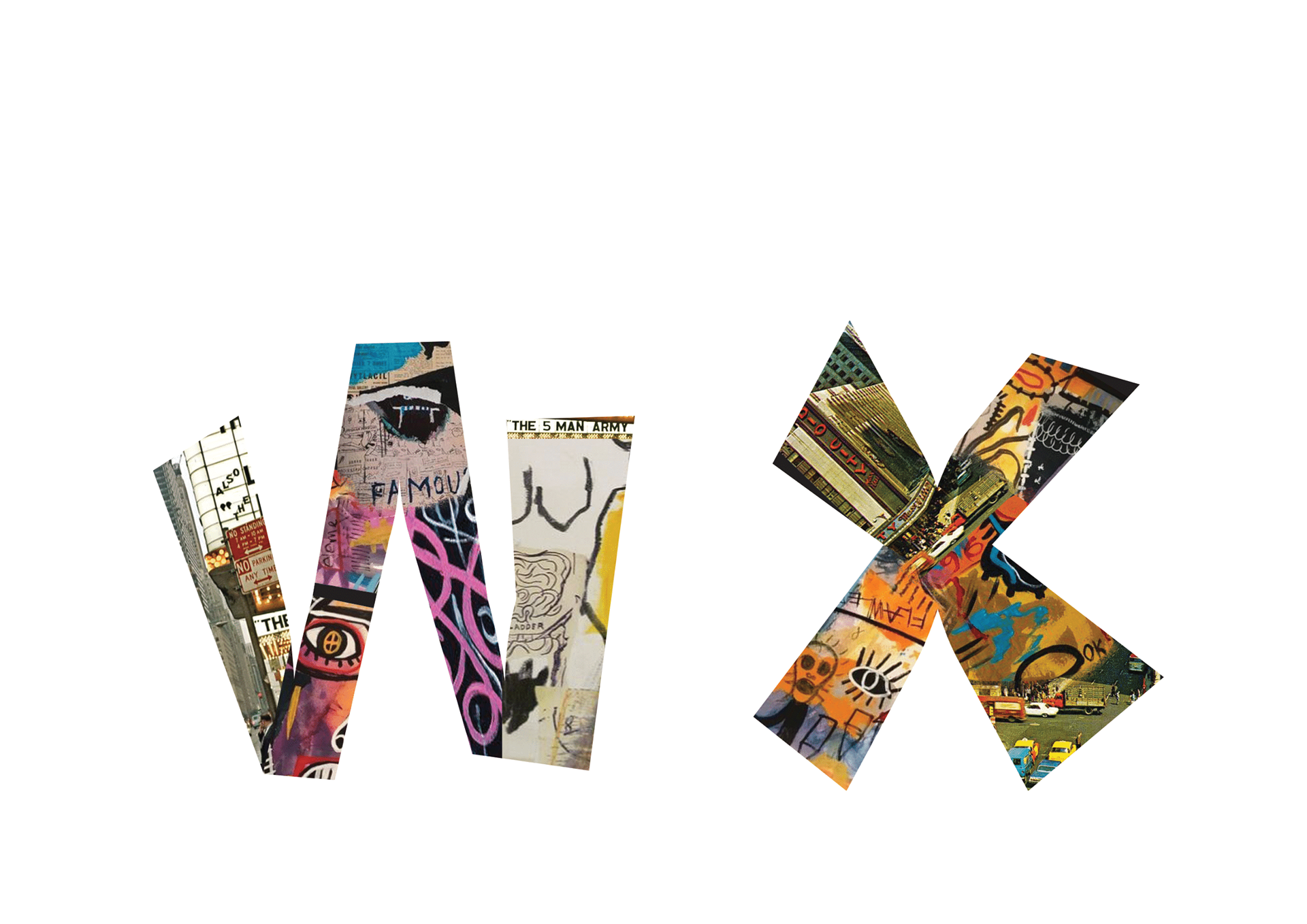
W-X
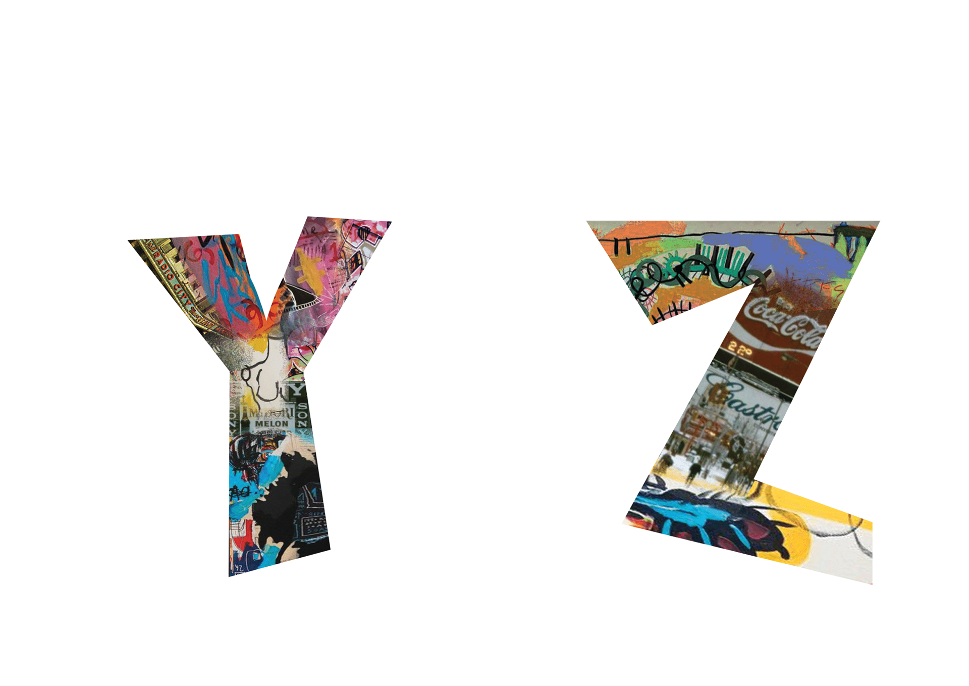
Y-Z
Front Cover
